Beautiful is not always clear
A website can look modern and still leave visitors confused. Too many effects, broad phrases, and similar blocks create fatigue. A person may leave even if the product fits their need.
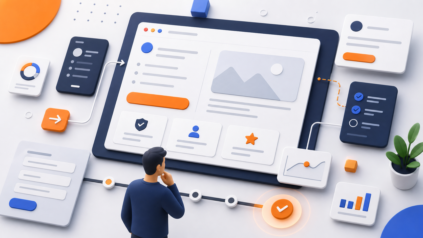
Good design starts with a simple question: what should a person understand on this screen? When the answer is clear, visuals support meaning instead of decorating it.
- The headline says something useful
- The visual explains instead of distracting
- The button leads to a clear next step
How a page guides a decision

People rarely read a page from top to bottom. They scan headlines, numbers, examples, and reviews before deciding to read more. Important information must be visible early.
A page works better when it has a calm rhythm: meaning, proof, details, and then action. This helps people stay oriented.
The form should be honest
A form should not feel like a demand without explanation. People need to know what happens after sending it, how long the reply may take, and why the fields are needed.
If a field is not needed for the first contact, remove it. Fewer questions make it easier to send a request.
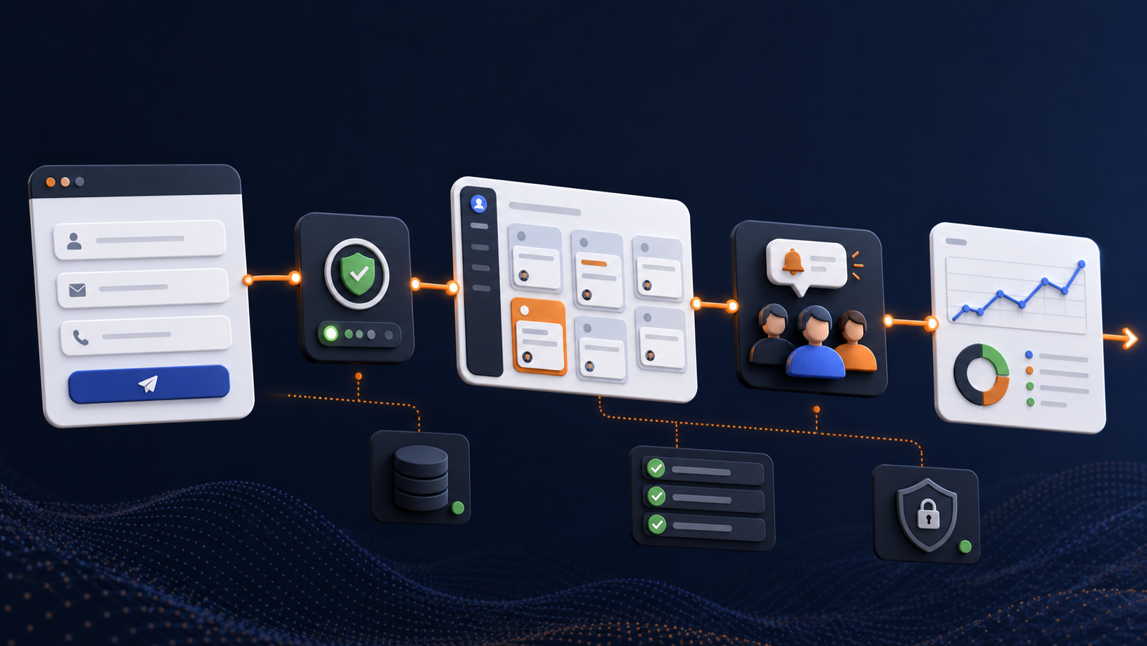
How to reduce friction
Friction appears when a person has to think too much: where to click, how the service is different, whether the company can be trusted, and what happens after a request. Design should not decorate this path. It should remove unnecessary questions.
Simple things matter: a clear first screen, one visible main action, good spacing, readable copy, proof next to promises, and a form without extra fields. When these elements work together, the website feels calmer and more convincing.
A strong interface does not pressure the user. It helps them understand the meaning and choose the next step.
- Remove extra choices where one choice is needed
- Place proof near promises
- Make the form clear and short
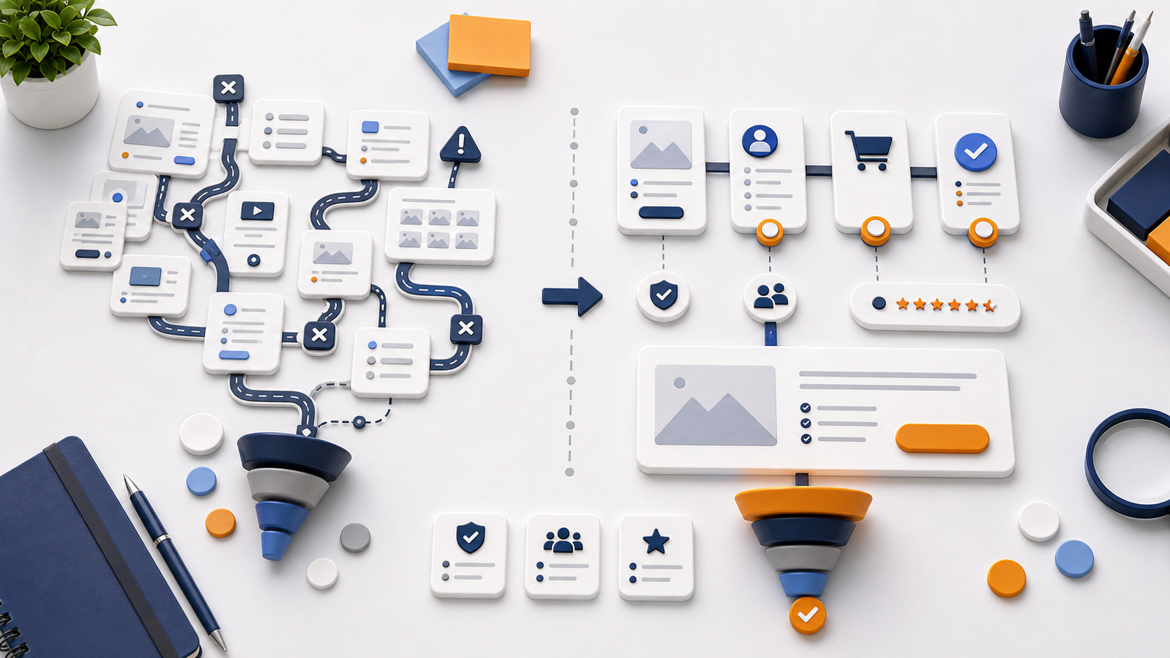
The first screen as a filter

The first screen does not need to explain everything. Its job is to show where the person is, who it is for, and why it is worth staying. If the visitor recognizes their task in a few seconds, they continue. If not, they leave, even if the content below is strong.
A good first screen works as a filter. It moves random visitors away and helps the right visitors reach the details faster. The headline, supporting copy, visual, and button should speak about the same thing.
The beginning of the page should not be overloaded. Too many benefits, buttons, and effects can hide the main idea.
Trust is built through details

Trust rarely appears because of one beautiful phrase. It is built with specific details: cases, numbers, reviews, photos, a clear process, terms, and answers to common questions. These elements should not sit at the very end of the page just to be present. They should appear near the decision points.
If the site promises a fast launch, show the steps nearby. If it promises experience, show cases. If it talks about complex development, explain the approach with clear examples. Design then helps the company show better, not shout louder.
The more expensive or complex the service is, the more important calm evidence becomes. The user needs reasons to choose, not pressure.
Responsive design without losing meaning
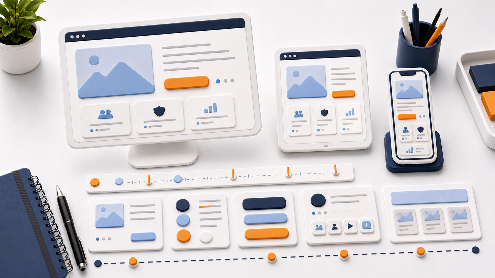
A mobile version is not a smaller desktop. On a small screen, attention, reading speed, and behavior change. What works on a monitor can feel heavy on a phone.
That is why responsive design should be planned separately: block order, text size, spacing, menu states, button length, forms, and cards. The page meaning must stay intact when the layout becomes one column.
Good responsive design is almost invisible. The person reads, chooses, and sends a request without fighting the interface.